Russian Restaurant Chain Tanuki Blends Minimalism & Wabi-Sabi Aesthetic Embracing Japanese Influence
- The Design Collective
- Jun 28, 2023
- 1 min read
Tanuki by Bureau Archpoint
Tanuki, the Russian restaurant chain embraces the essence of Japanese culture in its redesigned flagship restaurant. The new interior concept highlights a minimalist and open floor plan embodying Wabi-Sabi aesthetic.

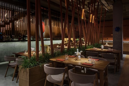
The new flagship restaurant design features a community table for ten to twelve people right in front of the entrance. It is situated closely to the illuminated bar counter which is an uncharacteristic object for traditional restaurants of this particular chain.

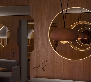
The new restaurant features the same cosy booths that regular customers of the Tanuki adore, but there are only a few of them now. They are located on the ground floor behind the ornately shaped partitions made of light plywood with round cut outs.

Natural materials like light plywood, terracotta and wooden furniture in discreet colours dominate the space. Metal chiselled “bamboo thickets” with illuminated potted plants, and sculptured concrete tile adorned columns subtly divide the dining areas.

Bespoke blue ceramic wall lights and voluminous red stone art objects add eye-catching touches while the open kitchen with a sushi bar serves as a prominent feature on the second floor.

Project: Tanuki
Location: Moscow, Russia
Design House: Bureau Archpoint
Principal Architect: Valey Lizunov
Photography: Olga Melekestseva
Gallery:


Comments