

Re-branding VIP by Lopez Design
An iconic brand revamps to capture the millennial footprint.
It's crucial that brands evolve and stay connected to the emerging generation’s aspirations. VIP, an established market leader entrusted Lopez Design with the challenge of rebranding them. Lopez design re-positioned VIP which caters to the future travel desires of the youth, moving beyond its image of basic and always ahead of the curve. The impact of the new branding was immediate as it got high visibility through its 8000 retail stores in India and a network of dealers across 50 countries. The fresh identity instantly related with the audience making a difference to its bottom line.
A deep study of the existing logo that revealed that it was straightforward and assuring, but lacked attraction for the younger generation. Disconnection of the old VIP logo with its millennial consumers largely because of the ‘fuddy duddy’ look. The brand faces competition from popular market brands American Tourister, Samsonite, Safari and Delsey and its own sister brands Skybags, Carlton and Aristocrat. Hence the brand needed to project a contemporary and trendy appeal with international vibes.
The new VIP is youthful, yet holds on to its true character and lineage. The team of Lopez Design visualized VIP as ‘a lifestyle brand that constantly reinvents itself to stay relevant.’
Lopez Design analysed the visual challenges inherent to the old logo, such as the reduced impact by the use of double elements - the VIP logotype and the mini globe next to it with a V in it, (which also resembled a Yes tick-mark). The letters V, I and P are separated by dots, making a direct reference to its derivation of Very Important Person.
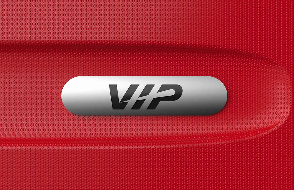
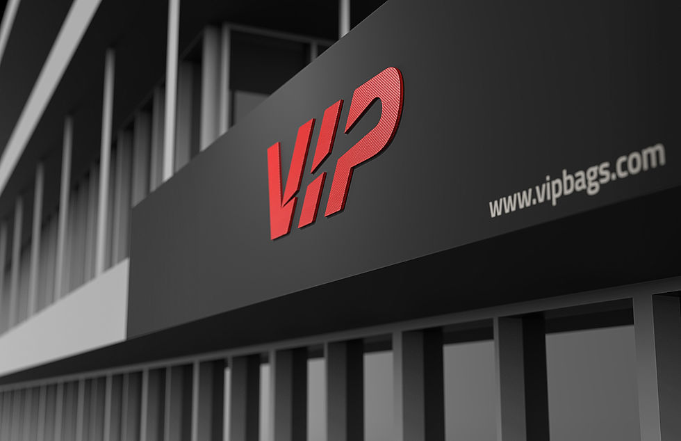
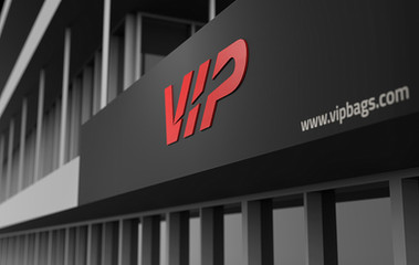
The new logo ‘VIP’ has been integrated with a breakthrough element of a comet-like swoosh cutting through the letters: this evokes the vision of a comet streaking through the skies. The logo’s trendy, compact and dynamic feel resonates with the fast pace of the current world, building a sense of timelessness and travel into the brand.
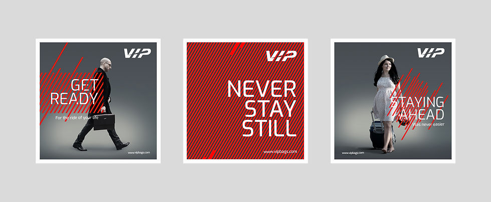
The revised graphic language takes off from the dynamic VIP logo. The patterns of red lines and dashes across the page, emphasize the diagonal, creating a sense of rhythm, forward movement and change.
Lopez Design retained VIP’s iconic red which has strong associations with high energy, youth and being alive. The secondary palette is dark grey and light grey giving it a dignified edge. The new identity sets the stage for a ‘new-age, self-assured and engaging’ brand.
Project: Rebranding VIP
Design House: Lopez Design
Design Team: Anthony Lopez, Sujatha Shankar Kumar, Mohan Godwal, Agnisesh Setlur, Deekshit Sabistain, Ajay Sharma


Comments